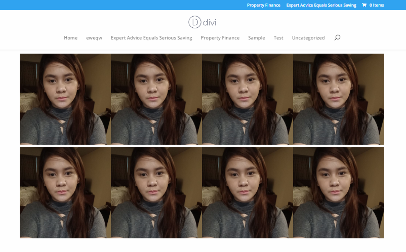
If you think the Divi columns features doesn’t support what you want in creating a mansonry grid layout either for your gallery, portfolio, images. This CSS grid will do the trick for you.
Basically, we will need to use 1 column and push all the elements vertically or horizontally depending of the design you wanted to create. In this example, we will create this kind of layout.
1.Open your page or post and create a one column row

2.Open the Row Settings by clicking the gear icon > Advanced tab > add a class name. As an example I use mygrid_column

3.Add a class on your inner module, As an example, I use lender_img


